
Aero Commerce
Ecommerce platform launches new identity
The people behind Aero are far from the new kids on the eCommerce block, but Aero as a brand remains relatively new. They launched with a previous brand in order to get going, but soon outgrew its look and feel. We were asked to create a fresh new take on the Aero brand in order to help them grow and continue to push their platform out to other agencies to use.
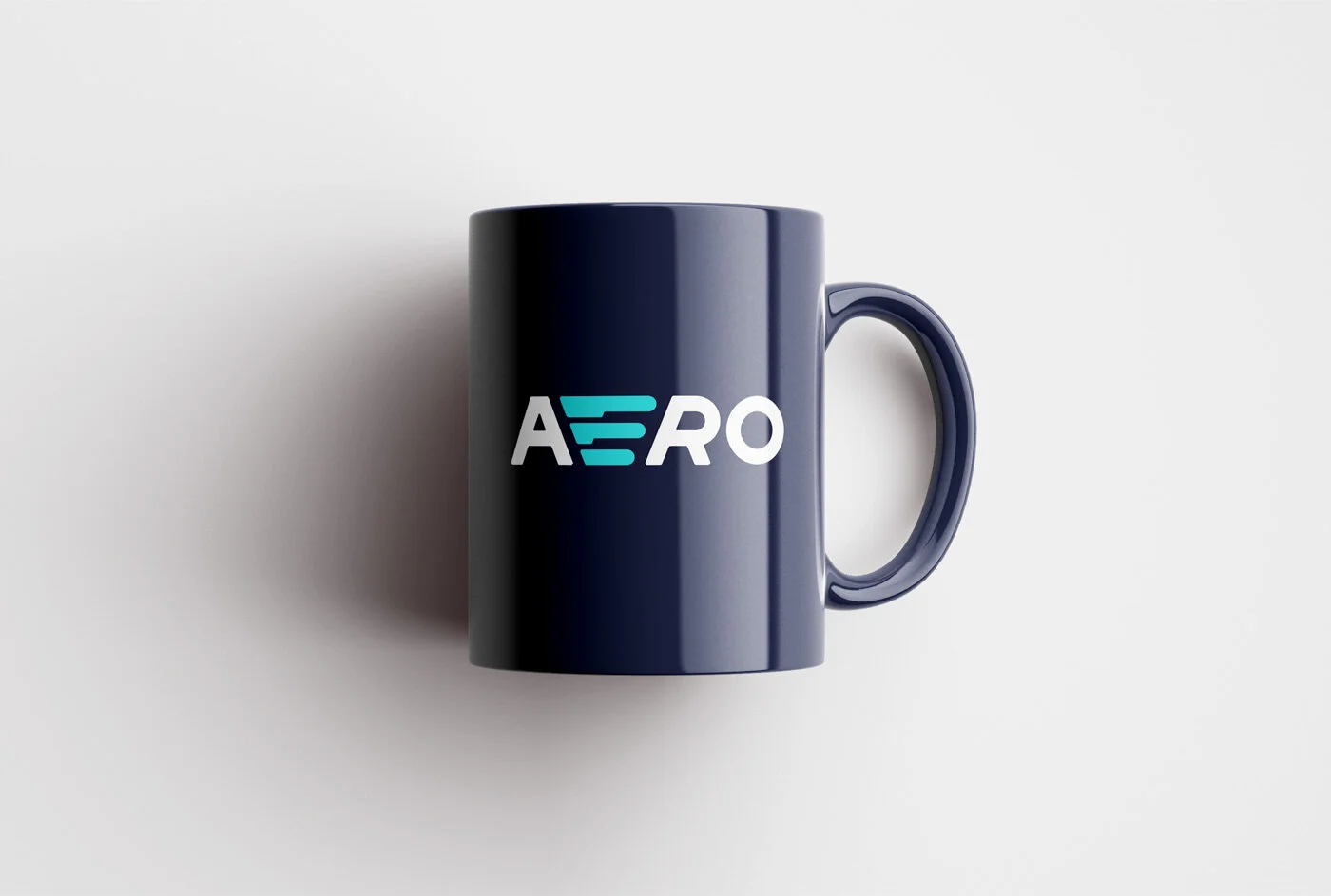
The Aero platform is notoriously fast, this was an instant starting point for us. We played with the idea of speed and agility being crucial factors in eCommerce and tripled the purpose of the letter E within the logo. It now suggests speed as lines coming from the letter A, it also makes the shape of a basket as well as simply being an E. We love it, so do our friends at Aero!


All design work was carried out by Renegade in 2020, and as such all intellectual property rights remain owned by Renegade.